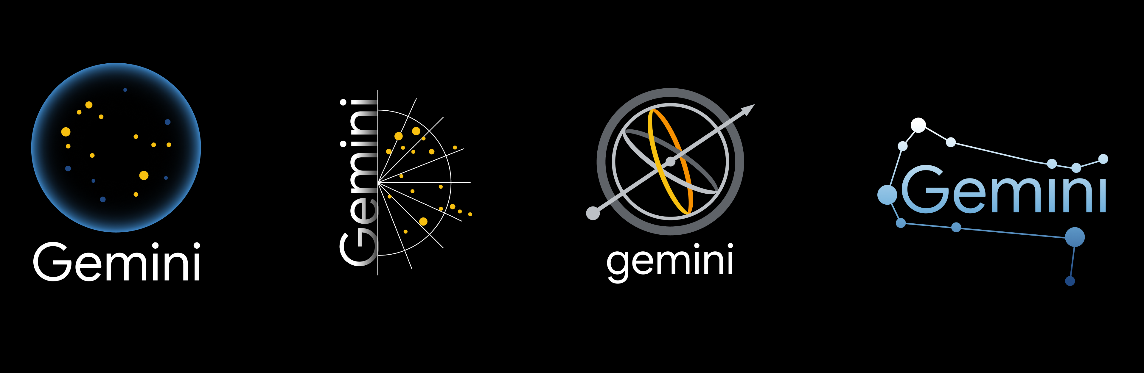
Project Gemini is an internal Google project for the UX and development teams. The launch of the platform required branding. The ask was to build a visual mark the encompasses the ethos of the team. The original thinking was that the platform would be built from black, not white. The team originally didn’t want the Gemini symbol. So this was the first attempt at the logo direction before they went with their Google “build from white” mentality.
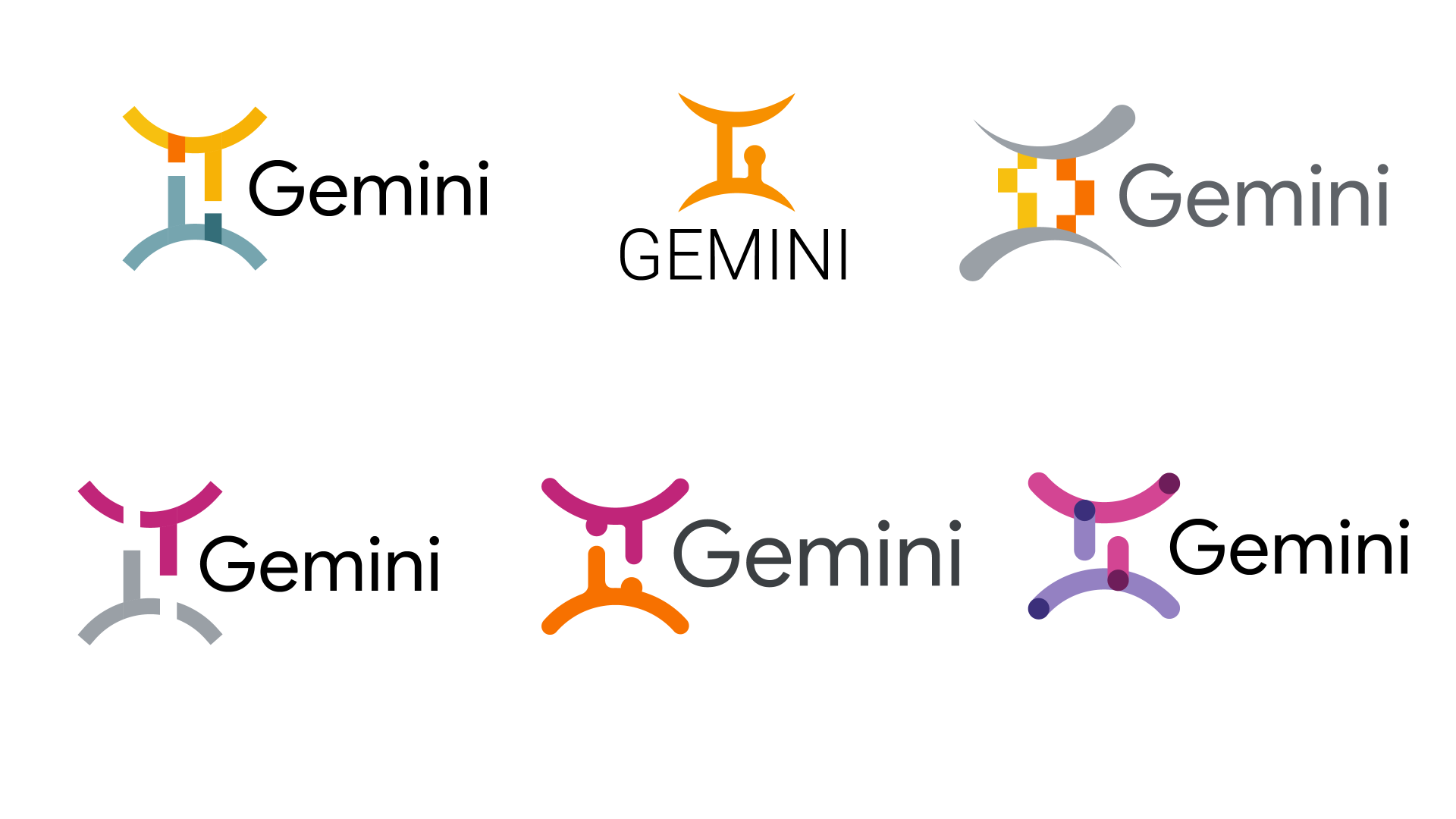
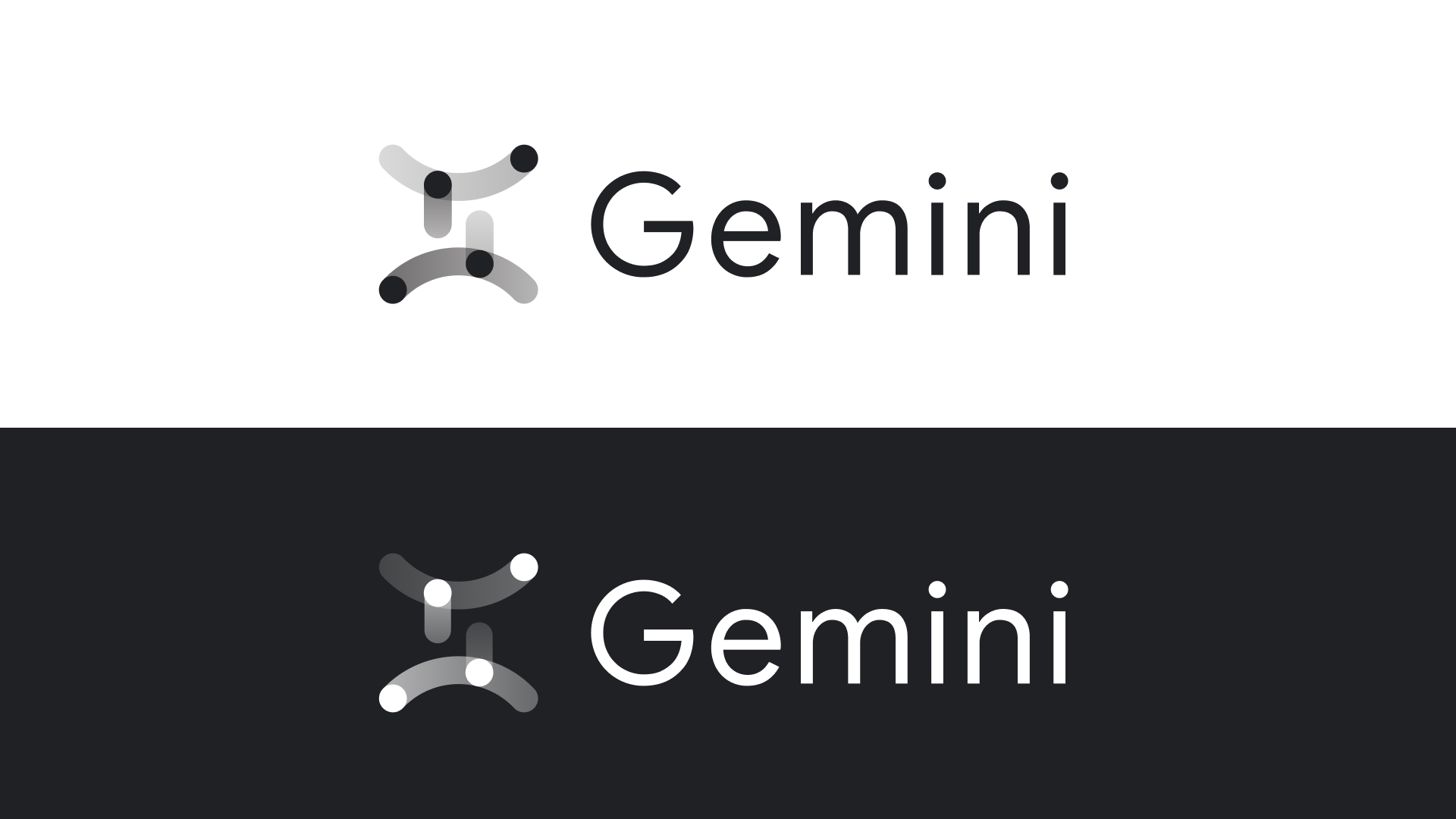
On brand shift, here you can see the beginnings of different ways the Gemini logo was interpreted as this was specific direction given after the first dark one and focus on the Gemini symbol itself and how to transform it.
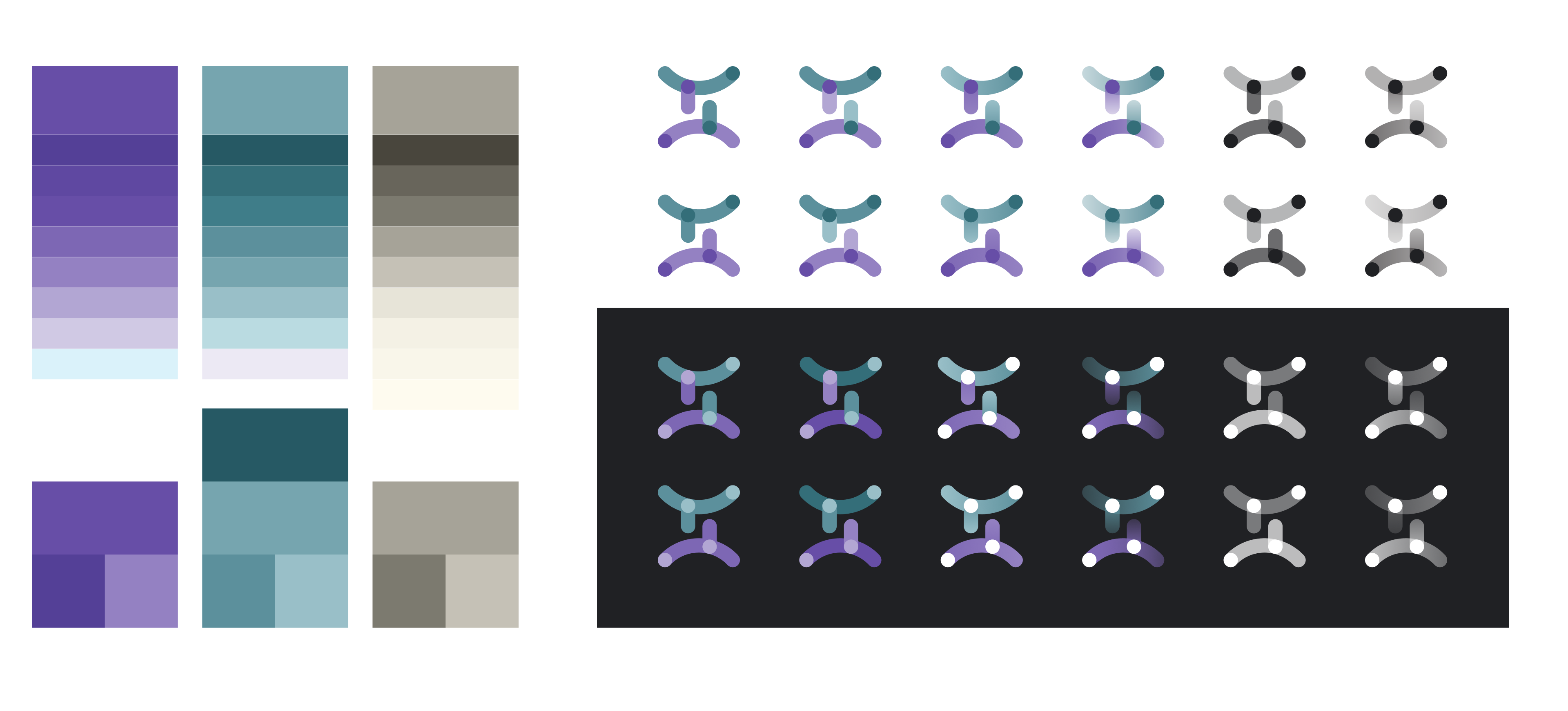
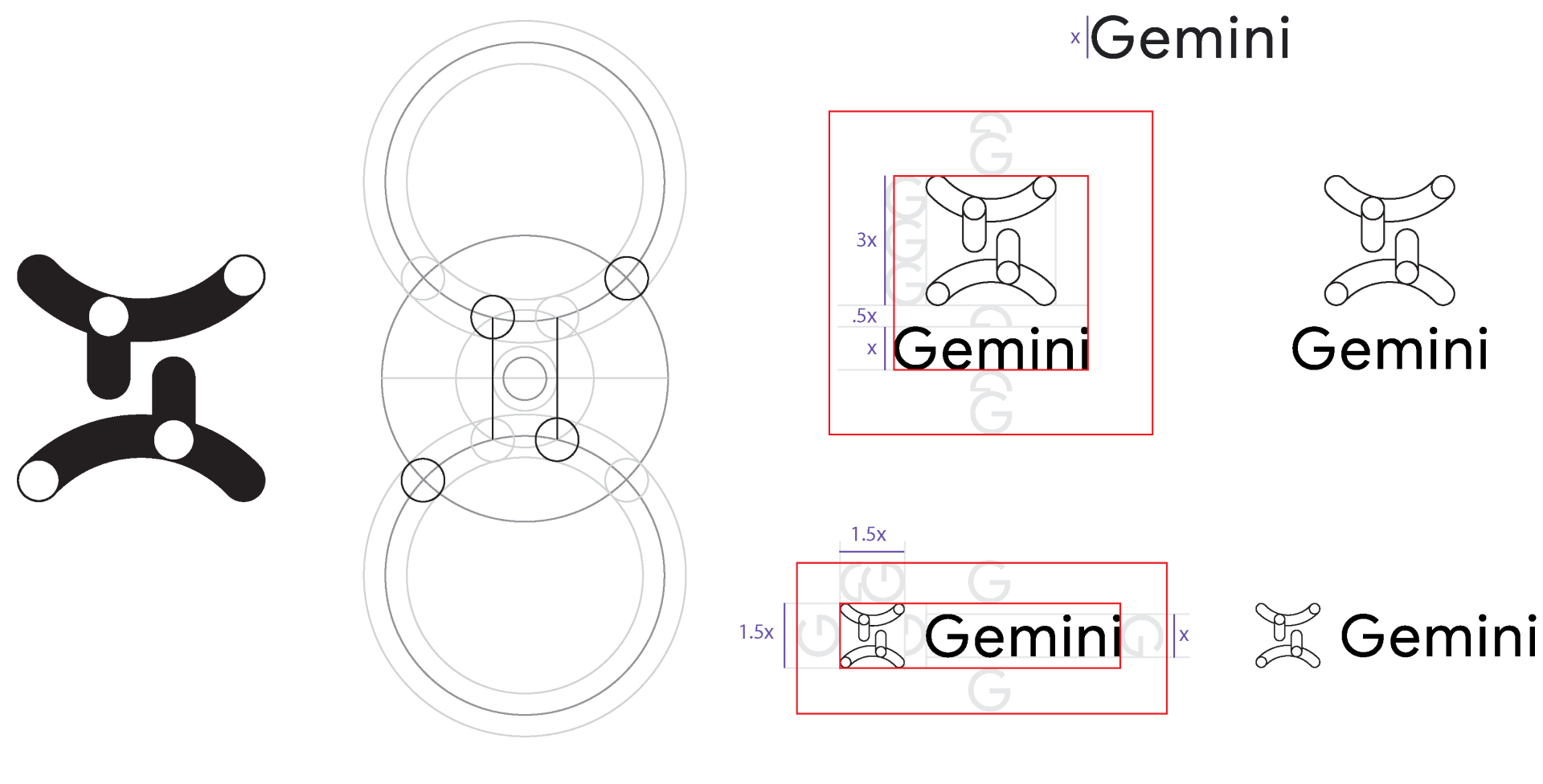
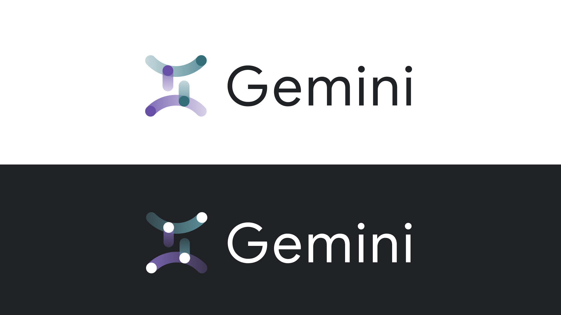
This was the visual mark chosen as it works in both light and dark modes, leans into the gemini symbol and also incorporates the theme of the project.
Creative Director Al Nicolini
Art Director/Design Lead Leah Pincus